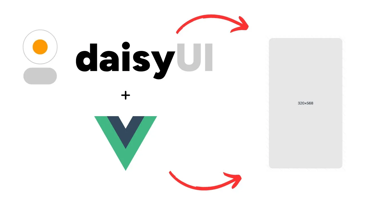
daisyUI Artboard Component for Vue.js
daisyUI Artboard Component for Vue.js
Artboards are useful for when you need a fixed sized container to display something on your website. In this post we will look at how to create a daisyUI Artboard component for Vue.js.
The daisyUI docs are decent, and provide a good starting point for an artboard component. However they don't currently have an artboard component that we can copy and paste directly into a Vue.js. But we can do this ourselves. This guide is suitable for any Vue.js project, whether this is Laravel + Inertia.js + Vue.js, Nuxt or any other form of Vue.
Before you create your daisyUI artboard component
Before we create our artboard component we need to make sure our project is set up to use daisyUI. We need to have TailwindCSS and daisyUI installed. Instructions on installing TailwindCSS can be found on the TailwindCSS website. Instructions on how to install daisyUI can be found in the daisyUI docs.
Once you have installed both TailwindCSS and daisyUI in your Vue.js project you are ready to create your daisyUI artboard component.
Create daisyUI Artboard component in Vue
We can now create our artboard component. In your components folder, create a new file named Artboard.vue. Paste the code below into your newly created Artboard.vue file.
<template>

    <div class="artboard phone-1 artboard-demo">
        <slot ></slot>
    </div>

</template>
Different daisyUI artboard styles
There are many different artboard components to choose from in the daisyUI docs. As they are there to mimic a phone screen, they have different sizes available. Your best bet is to check them out for yourself and experiment with the sizes available.
You can also add a artboard-horizontal class to display the artboard horizontally!
It doesn't matter which style you choose, the concept of converting it to a re-useable Vue.js component is the same. The example above is a 320×568 artboard that is vertical and has no background colour. The same result can be achieved using any of the artboards available on the daisyUI website.
Artboard.vue code explained
The Artboard.vue component is very simple. It has one slot. This slot allows you to add any content you like. Whether this is simple text or html elements. Pretty good.
The same result can be achieved by passing props. However in this case I think it makes sense to use slots.
Use the daisyUI Artboard component in your parent component
Now we have created our artboard component, we can use it in other components. This is easy to do. See the example below:
// Parent component
<template>

    <div>
        <Artboard>
            <div>
                Some content in a div
            </div>
        </Artboard>
    </div>

</template>
I am using Nuxt in this example. I therefore do not need to import the Artboard.vue component. If you are not using Nuxt, you will almost certainly need to import the Artboard.vue component into your parent component.
Parent component code explained
The above code in the parent component outputs the Artboard.vue component. The content between the Artboard tags is outputted in the slot withing the artboard component. As mentioned previously. This content can be plain text or html. And the same result can be achieved using props.
What? daisyUI has templates!
Why should we make our Artboard components re-useable in Vue?
By making our Artboard component re-useable we save a lot of time. This is because we only have one version of the component to maintain. We can reuse the component as many times as we want. And just pass in the data we want to display each time! This means that if we want to change the styling of our Artboard component, we only need to do this once! Rather than changing it in loads of different components.